Wednesday, 14 December 2011

Poses

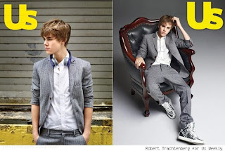
When thinking of poses I researched to see what props and things I could use in the images. I have considered using musical instruments however it wouldn't connote the RnB image. I am going to have a black and white image for the front cover because I think it is quite striking with a good model. A B&W image can be quite striking making the shadows bold. 

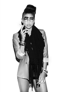
If i decide to use a close up i will have a fierce looking pose to connote determination and elegance. Using female models as well as male means I am able to use lots of different props. e.g. Clothing, Jewellery.

Fonts

After asking my target audience which font they would prefer I came to the decision I would use capital letters for my headline. The font the majority liked was a bold sans serif font. The fonts I showed were all sans serif because I think they are more Urban than serif ones. Sans serif fonts are much more informal suiting a younger audience. 

Monday, 12 December 2011

Facebook feedback

ideas

For my front cover I will use sans serif because it is much more informal fitting the genre. Also i will use bright colours like red, blue and yellow to draw more attention to it. For my contents page I am thinking of either having a top charts or an upcoming artists column. Also on my contents page I will have lots of images of my models striking interesting urban poses.

My potential models


Jess

I have chosen these models because they all have their own quirky fashion sense making them all unique and I wanted to denote that in my magazine. I will use props to make them fit the RnB genre more. 
Erin
Louis
Henry

Thursday, 8 December 2011

Potential Poses/clothing

If I was to chose a male model I would use props such as sunglasses and large jewellery to fit the image. I will use an urban looking model with their own fashion sense. The clothing I will use will be smart with a little urban fashion edged in. e.g. high tops or jeans. The pose will connote a determined young person who believes in themselves. I will choose an attractive model because with my research I found out that RnB magazines are not only used for the content but teens use the covers to stick on their walls or other places. e.g. topless models.
For my female models I will use bright colours for their make-up to make it look bold and attention seeking. Their facial expressions will connote a fierce, independent and successful person. Jewellery is important to show the image of a RnB artist because they are shown to wear big gold chains and big earrings. They must wear subtle but elegant clothing to ensure the jewellery is more noticeable. For their hair I will aim to choose a model with interesting, different hairstyles so I can change it through different shots.

Wednesday, 7 December 2011

Audience Profile


The audience for my music magazine will be mainly teenagers into mainstream RnB. They will fit mainly C-E on the Jicnar scale. They are the type of people very into fashion, keeping a mainstream image. They are the type of people who feel there is more to life than just an education, e.g. fashion and music. They are very social people that would rather spend time with friends than at home revising although they may need to. They will be into keeping up with the charts and listen to artist such as Rihanna, Usher and Nicki Minaj. Although my target audience is into mainstream music they like to have their own independent style which is bold and quirky. Their favourite clothing stores being Topshop, Riverisland, Office and on online stores like Urban OutfittersThe clothing worn by my audience is urban, hip-hop type of fashion. Their make-up is bold and attention seeking with large hair. 

Monday, 5 December 2011

Thursday, 1 December 2011

Research

The centre of visual interest is very bold connoting a fierce, determined and important person. The image is very saturated making it much brighter and more eye catching. This magazine has bled the image across the page with a large callout in front of the image. In the top left corner they have added a filter to cover a unwanted gap on the cover. The main cover story is very bold spreading entirely across the front page. The expression on Rihanna's face connotes a angry, fearful and unapproachable. With an image like this it shows the artists determination to succeed. The  masthead 'Billboard' is relative to the type of magazine because artists are advertised on billboards. The filled in 'b's' in the masthead also contributes to the brightness of the cover. . The masthead is sans serif fitting the target audience because it is aimed at the younger more informal generation. Along the left there is a large amount of wobs, this makes the comments more eye catching. 
The contents page for this genre uses lots of images which makes it much more interesting for the reader. RnB magazines uses are for the image of the artists not just the information. RnB magazines denote how an artist expresses themselves through their image. Down the left side of the contents page there is the charts which is important for the audience as they are the type of people who want to keep up to date with the new releases. The images are related to the articles so are linked to a number boldly for the reader to easily access that article. 

Thursday, 13 October 2011

Evaluation

The title we decided to use was 'Result' which we feel denotes a positive attitude and success in attending college. We used sans serif for the title because it showed an informal feel to the magazine fitting the relevant target audience. The block lettering is bold and eye catching.
    We chose to use a pricing label on the front cover boldly showing the audience a clear indication to how little it costs (equal to the value of a fizzy drink), which may be considered good value only amounting to £1. Our choice of story lines covers a variety of pertinent issues that may be experienced by young people of the age group that attends college, ranging from learning to drive, cool fashions and entertainment. A competition was advertised on the cover to give the reader an incentive to purchase the magazine and hence may in fact help towards their study if they were successful in winning the Apple Mac Laptop. 
    The image we chosen was a young, fresh faced, healthy and vibrant girl with a slightly radical twist blowing bubble gum may be appealing to a younger audience making them relate to the image. The overall look of the cover is well balanced, colourful and may even appeal to both genders although the target market may tend to be female as we used mainly bright colours for the cover lines. 

Monday, 10 October 2011

Finished Products

This is our front cover finished. 

This is our layout for our contents page.

Images


It took us quite a while to get the right shot because when blowing a bubble you cannot choose the face pulled, we wanted a determined look to connote a passion for success. We tried a variety of people to make sure we got the right image, we also tried inside and outside for different lighting.

Evaluation of research and ideas for our magazine

After researching into multiple college magazines we noticed common features that was in a large quantity of the college themed magazines. We noticed that all magazines aimed at students used a sans serif font because it connotes a more informal approach. So we decided to use both however our masthead the main focus is sans serif. We also decided on our cover lines because most college magazines had things about lifestyle on the front so we decided to do the same using things like university and driving licences as these are common things in a students life. The cover picture we used is very fun and welcoming which we felt fitted the magazine. Although most student magazines were full of studying information we felt most students would like to read about fashion as well so one of our cover lines were based on fashion. One of our cover lines was 'Top 5 Student Bars' we chose this because most students enjoy to spend time with their friends in a fun environment so we feel this would be a successful selling point as we are understanding the students needs. The last cover line we chose was a competition to win a high quality laptop, with this it gives students that may not be able to afford a laptop the chance to win one. The name of our magazine was 'Result' we chose this because most other college magazines are focused around studying or lifestyle so we think result gives a focus on what the students are working towards, results. 

Thursday, 29 September 2011

We have decided that we want to use a sans serif font because it makes it less formal and we think it suits the audience our magazine is aimed at. 
We then looked at different colour and shading we can use for our font for the masthead.

Our Time Management;

We Define Our Readers As;

  • You are in full time education 
  • Your phone is never found more than 3 metres away from you 
  • You have an interest in music 
  • You would always rather be with your friends 
  • Your weekend revolves around you getting drunk.... even though you're not legal 
  • The majority of your money is spent on food 
  • You're willing to spend more than you should on looking good 

Research On Magazines.


We looked at College Magazine and also looked at other magazines targeted to the student audience.
With the two College magazines that we compared we noticed that it featured photographs of people students would be unaware of. However the pictures on TeenVogue and Billboard are both very famous celebrities. On College the two images represent students, they are both smiling at the camera which connotes friendliness, confidence and a genuine image. It also displays connection to the potential buyer. Similar to the image on College, TeenVogue also shows a person smiling connoting happiness, warmth and confidence. However the image used on Billboard is very much the opposite showing Eminem, a famous rapper scowling at the camera connoting power, strength and his hand on his heart connoting pride. 
The colours used on both magazines are very similar. On the two feminine covers there are brighter colours used like red and pink whereas on the masculine covers there are greens and blues with a dark background. This connotes the difference between female and male preference.
 On both magazines the College one and the more commercial one both use Sans Serif showing it is aimed at a younger more informal audience. Both College magazines use capitals connoting importance and urgency however Billboard and TeenVogue don't. The more mainstream magazines, TeenVogue and Billboard's cover stories are mainly featuring fashion unlike College which features stories about lifestyle and college life.